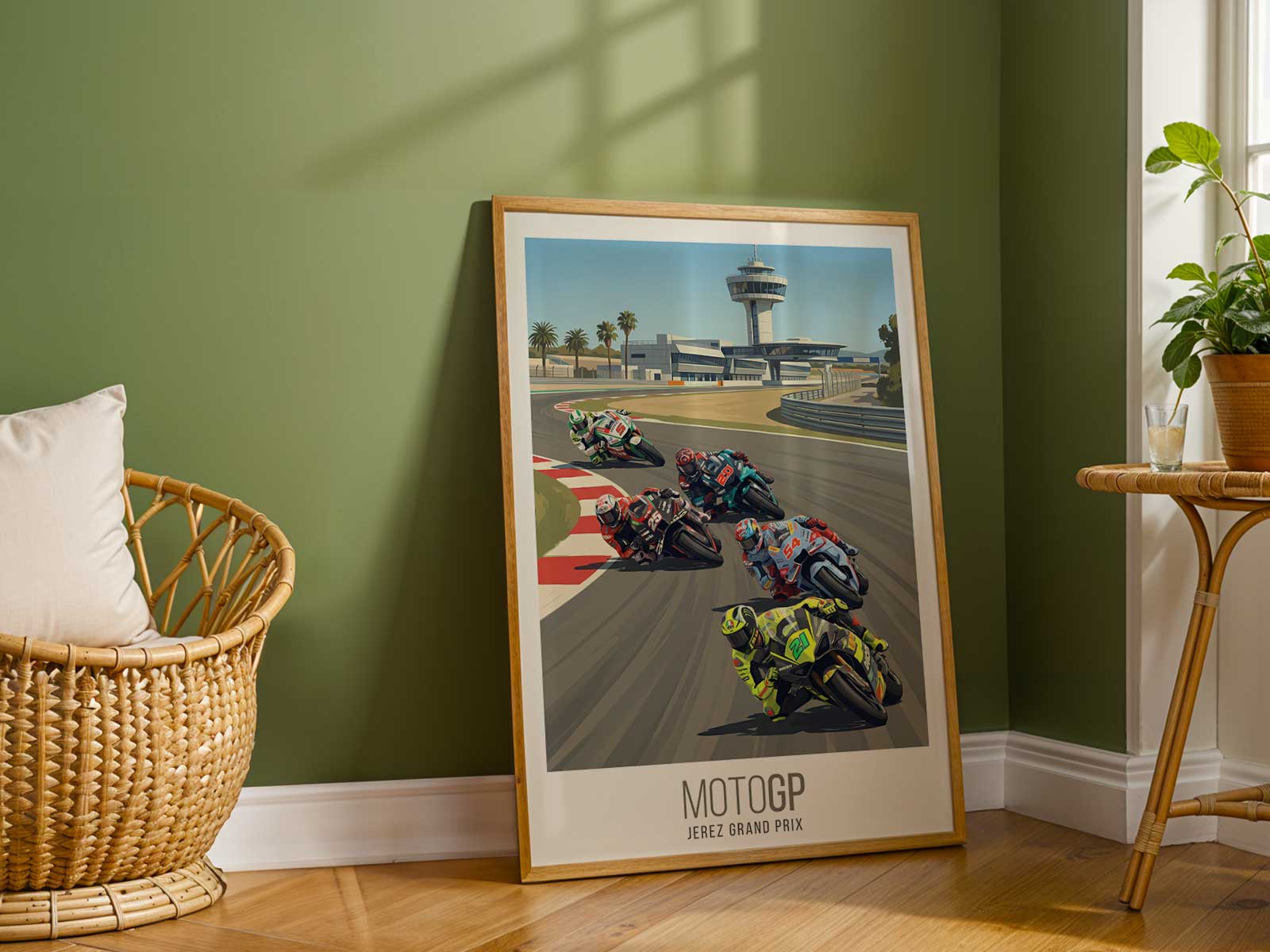
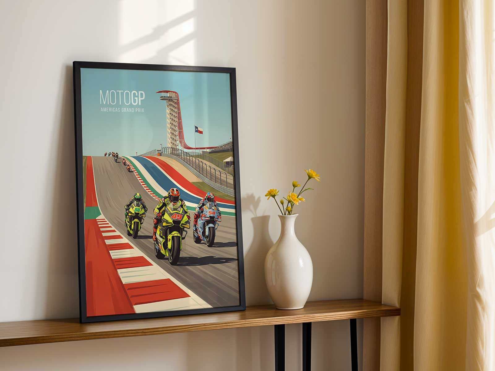
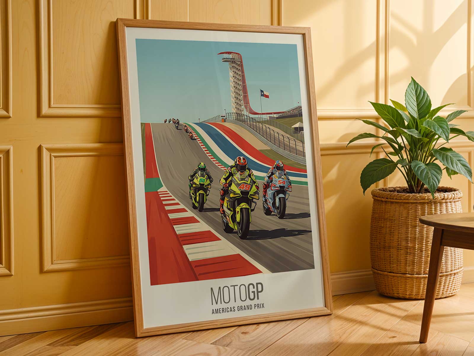
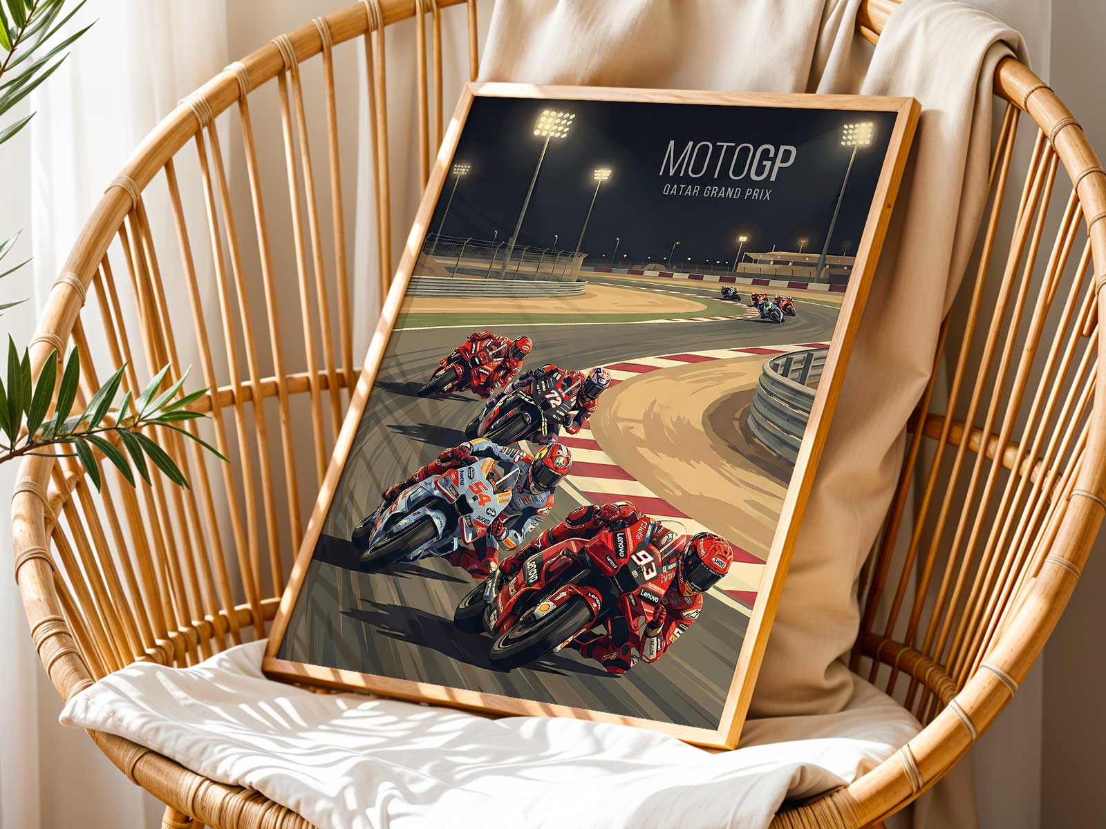
There is a particular power in a MotoGP poster that puts place before persona. In the case of a French Grand Prix image, the poster often reads like a condensed landscape—horizon, trackbed and spectator terraces compressed into a single, decisive frame. The circuit becomes the protagonist: its elevation, its run-off slopes, the curvature of a famous corner and the way sky and light meet tarmac all combine to give the image a distinct sense of location that a rider’s name alone cannot convey.
What transforms such a poster from illustration into atmosphere is the way landscape and light shape perception. Early morning mist or late-afternoon glare will change the weight of shadows on asphalt, accentuate wheel spray, or make the concrete of a grandstand glow like a low wall of colour. Those optical cues tell you not only that this was shot at a particular French track, but that the moment carried a mood: cool, brittle, humid or sun-struck. The poster thus acts like a weathered page from a race diary—specific, transportive and quietly narrative.
Beyond weather, elevation and composition explain why circuit-led imagery feels so collectable. A poster that hints at a steep approach, a long sightline or a bowl-like amphitheatre of stands gives the viewer a spatial memory to inhabit. Even without knowing turn numbers, the eye reads the photograph as a place you could stand in: the angle of the run-off, the rhythm of the kerbs, the way barriers and catch-fencing recede into the distance. That spatial logic is what makes the piece readable across rooms—office, garage or living room—because it anchors the décor to a believable, three-dimensional world rather than an abstract action shot.
[IMAGE_INSERT_ARTICLE_01]
Crowd presence and grandstand geometry lend another layer of storytelling. A tight, packed terrace suggests pressure and expectation; a scattered, windswept crowd suggests endurance and the long arc of a race day. When a poster retains traces of the audience—rows of tiny helmets, flags blurring in the wind, silhouettes against the sky—it adds social texture to the image and reinforces that this is a public place with its own rituals. For interiors, that human scale softens the mechanical sharpness of motorcycles and makes the art read as lived-in memory rather than pure spectacle.
Compositional choices such as crop, horizon placement and selective focus accentuate the poster’s dramatic tension. A low horizon amplifies sky—cloud banks, sunbeams or heat haze—while a close crop on a braking machine forces attention on lean angle and kinetic strain. Those specific visual decisions create emotional shorthand: the suggestion of speed suspended, the compression of a whole race into a single charged second. This is why such posters feel like statements rather than background images; they invite a second look and reward it with layers of detail.
In decorating terms, circuit-led MotoGP imagery provides sustained character. Where abstract art can set a tone, a track photograph sets a place. It can stabilise a room’s palette—muted asphalt greys and sky blues, a flash of team livery—and offer a focal point that reads as both adventurous and composed. In a studio the poster can be an origin story for design choices; in a garage it quietly affirms craft and heritage; in a gaming corner it supplies context and narrative for the hours spent there.
Finally, the desirability of a French MotoGP poster comes from its capacity to evoke memory without needing to document it precisely. Whether the image leans into sweeping landscape, granular texture or crowd energy, it allows the viewer to project their own race-day recollections into the frame. The result is a wall piece that is atmospheric rather than illustrative—a fragment of place that keeps returning to the room’s mood each time you pass it.
Place, light and tension: together they make a poster that feels like a location worth inhabiting.