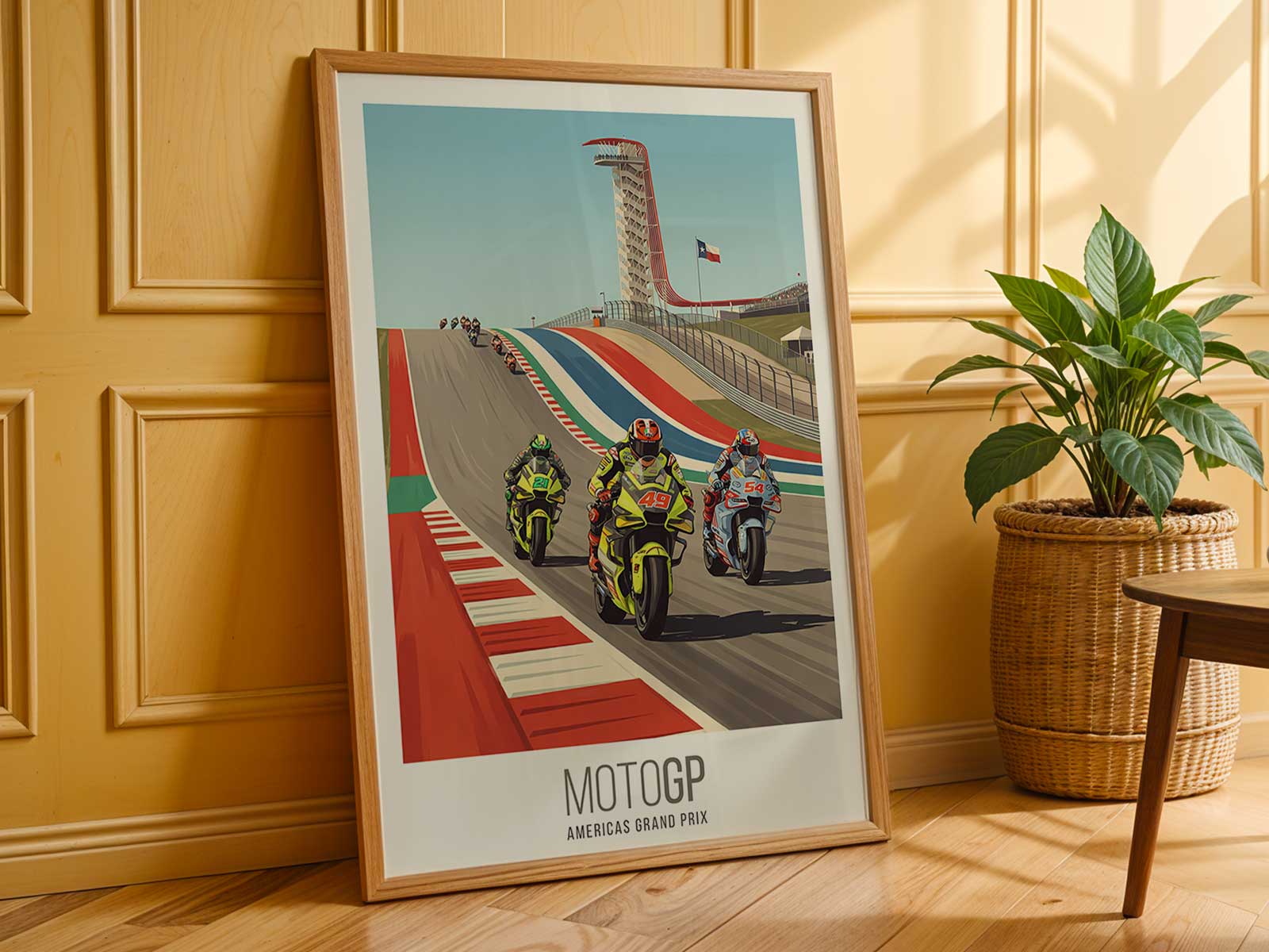
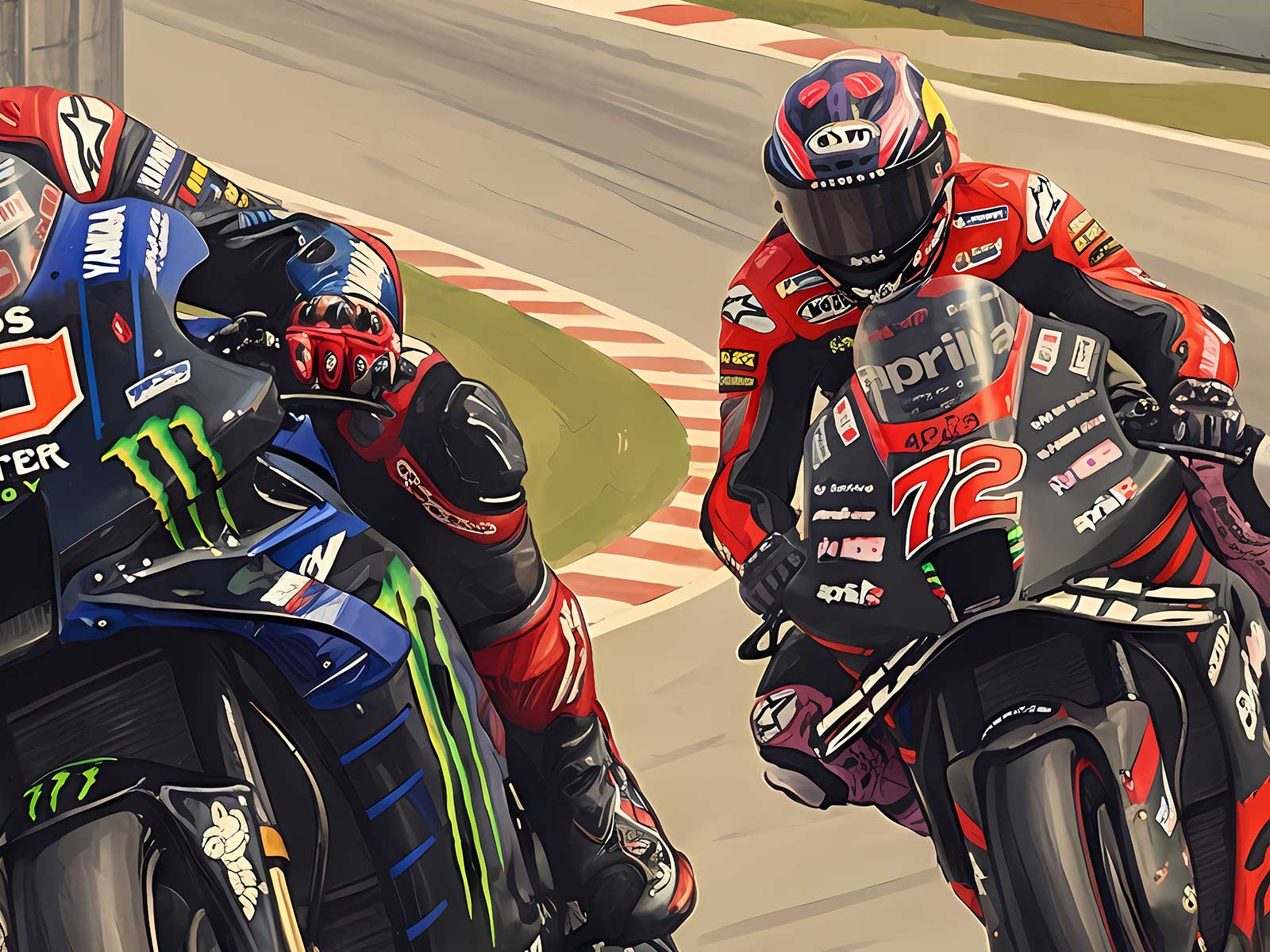
A great MotoGP poster does more than show a helmeted figure on a bike: it compresses motion, decision and force into a single still image. In this Maverick Viñales poster the rider’s body becomes the structural language of the composition. The angle of the shoulders, the tuck of the head, and the distribution of weight along the machine read like verbs — braking, committing, resisting. Those elements are what make the image feel taut, decisive and visually magnetic on a wall.
Look first at the shoulder line: it acts as a directional arrow, guiding the eye into the turn and anchoring the bike’s lean. Where the shoulder drops toward the inside of the corner, the poster suggests an aggressive negotiation with traction rather than a relaxed sweep. Simultaneously, the head placement — slightly forward, eyes implied under the visor — gives the composition a sense of forward intent. This is not a passive portrait; it is a rider actively shaping space.
The arms and hands are subtle narrators of effort. A compact, controlled grip combined with visible forearm tension communicates braking and modulation: the instant between full commitment and controlled surrender. Those micro-tensions are what separate a generic action shot from a study of racing craft. In wall scale they invite viewers to appreciate the technical calm beneath visible aggression.
[IMAGE_INSERT_ARTICLE_01]
Lean and counter-lean define the silhouette. The bike’s angle against the track flattens into a graphic wedge across the poster, while the rider’s body negotiates balance with shoulder and hip alignment. That negotiated balance is a visual shorthand for confidence — the quiet, practised control required to hold speed and line. In an interior, this compositional tension reads as energy rather than chaos: it is composed movement, the visual equivalent of a held breath.
Texture and negative space in the artwork further emphasise the rider’s authority. If the background is compressed — blurred track, a hint of curbing, or simplified graphic fields — the rider and machine stand out like sculpted elements. The contrast creates a focal gravity that defines the room’s atmosphere: an office or study takes on precision and focus, a garage or game room gains competitive edge, and a living area acquires a narrative object that invites repeated viewing.
What makes a rider-led poster particularly effective is how it translates physical mechanics into emotional perception without naming them. The posture reads as determination because of concrete visual cues: forward-leaning torso for commitment, tucked knee for line control, elbow position for steering nuance. Those details let the viewer infer speed and risk while still appreciating the aesthetic rhythm of form and motion.
Choosing this kind of poster is an act of curatorial clarity. You are selecting an image where a single human figure communicates the sport’s layered drama — the technical demands, the personal focus, the momentary balance between machine and will. On a wall, it becomes less a celebration of fame and more a study of motion made still: an object that rewards close looking and quietly reshapes the room’s energy.
Note: this article interprets the visual language of the poster. It focuses on posture, body mechanics and compositional impact rather than specific race contexts.