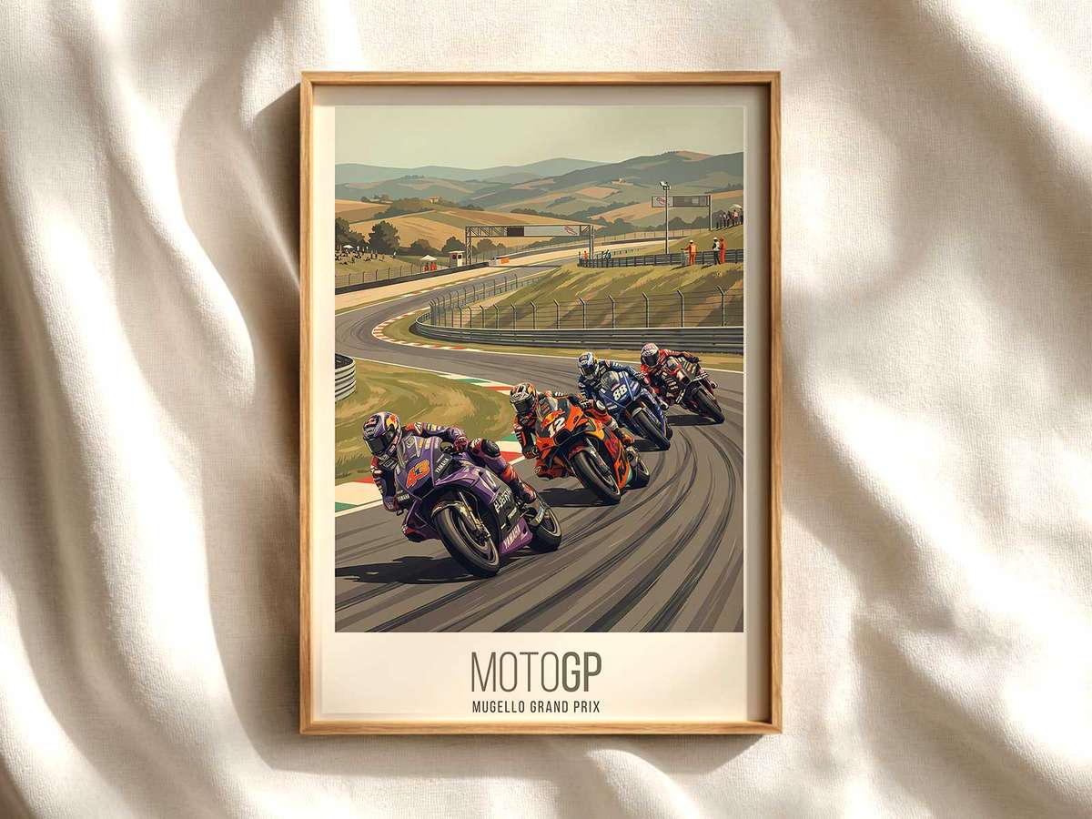
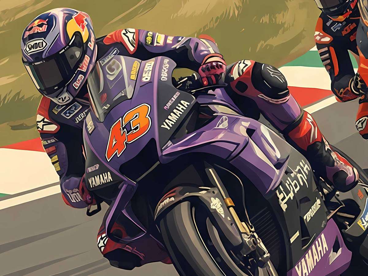
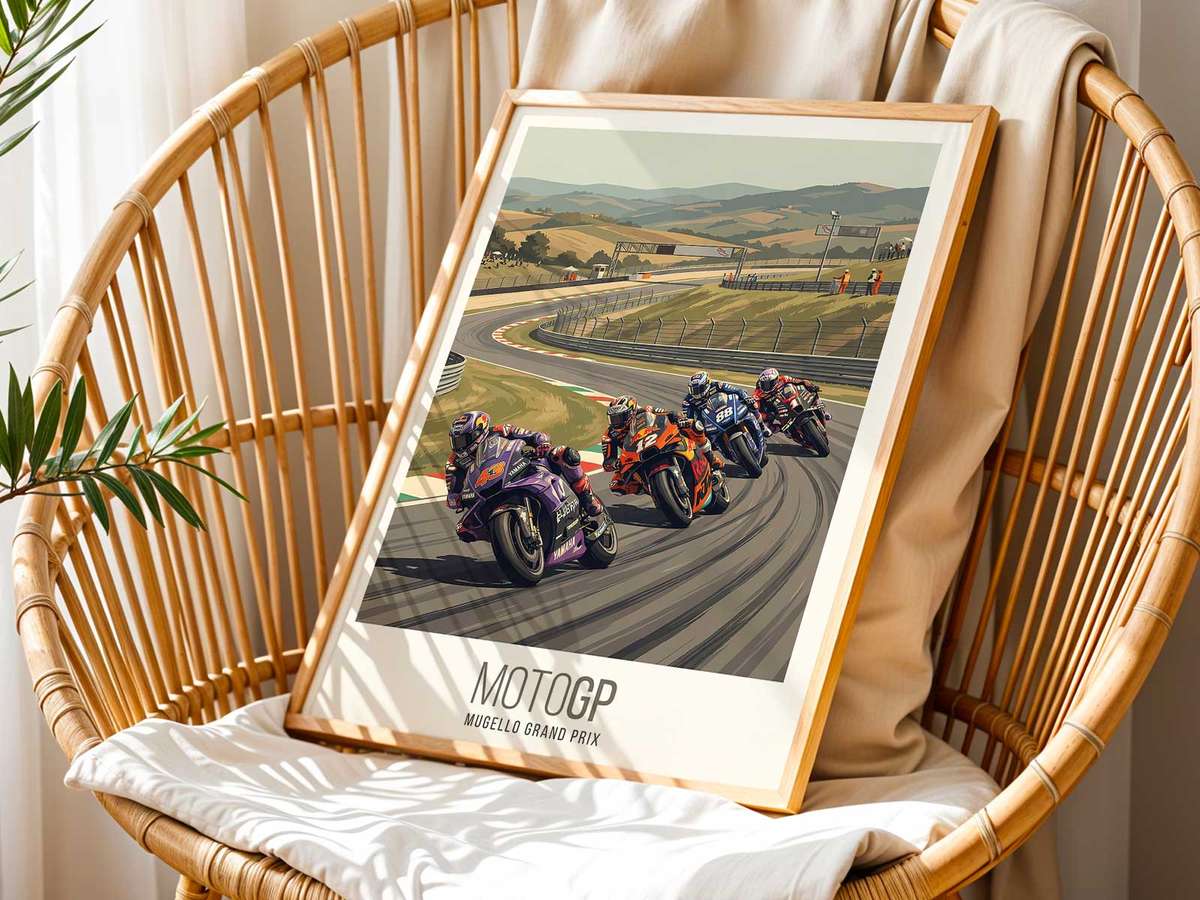
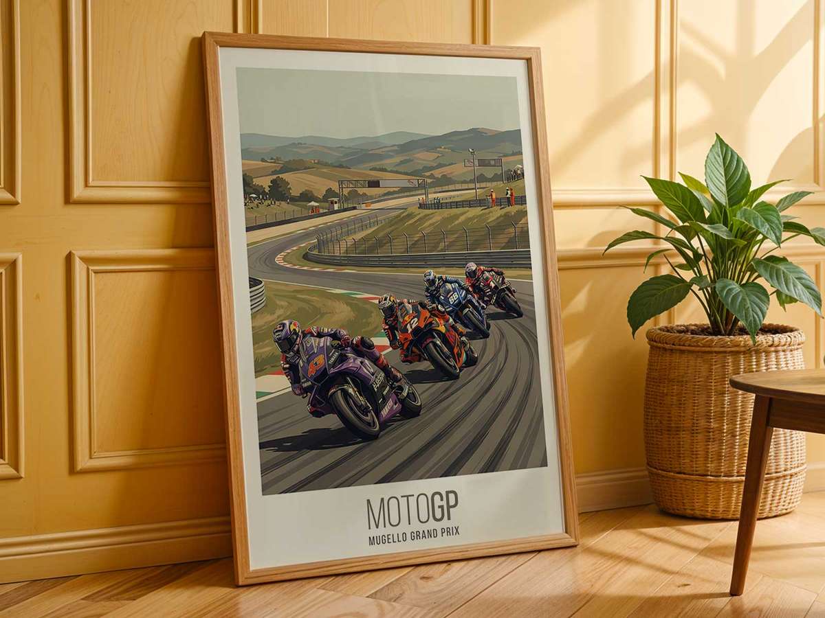
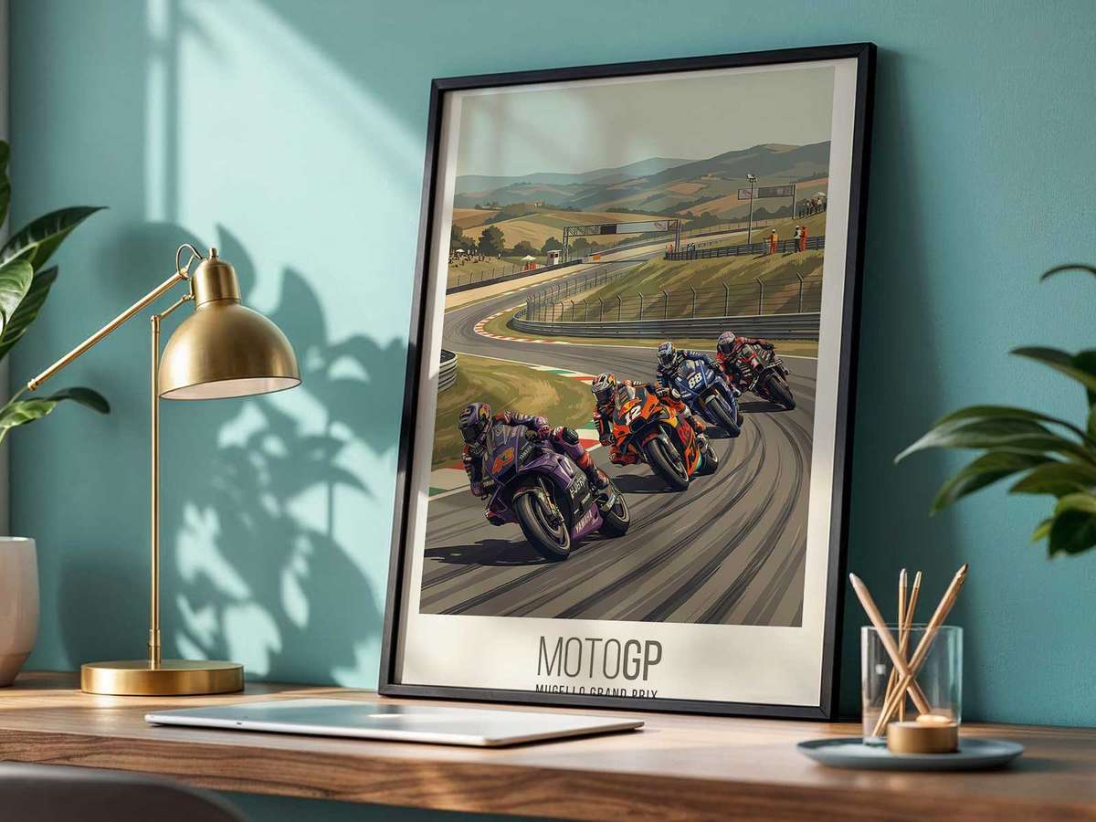
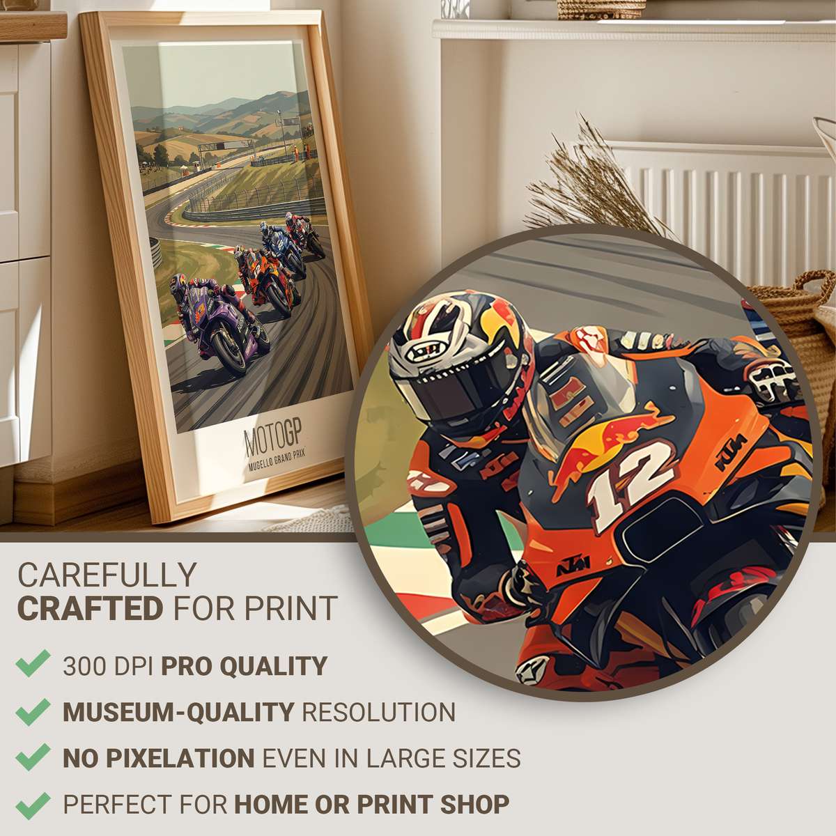
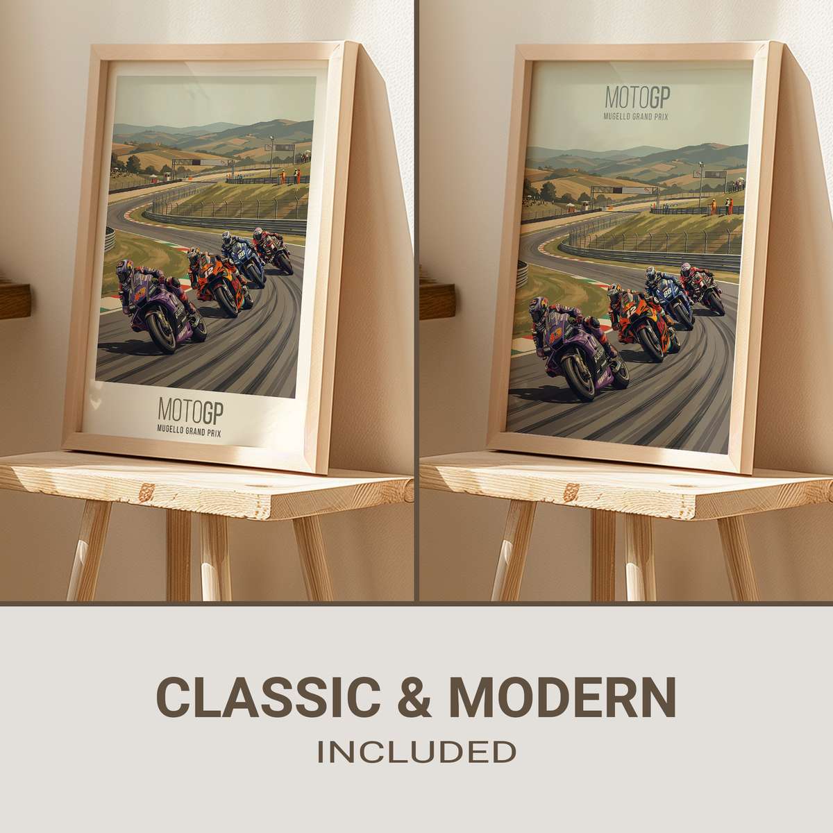
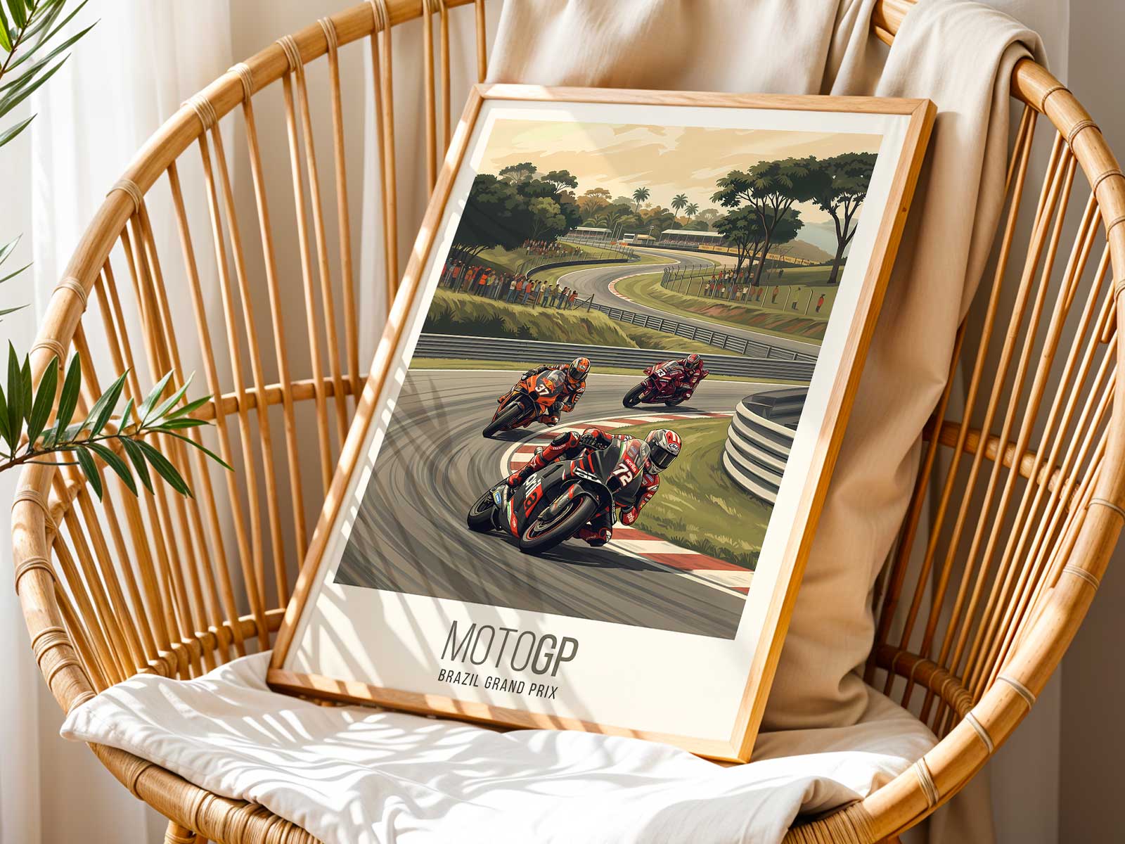
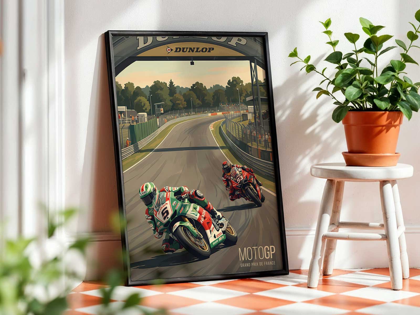
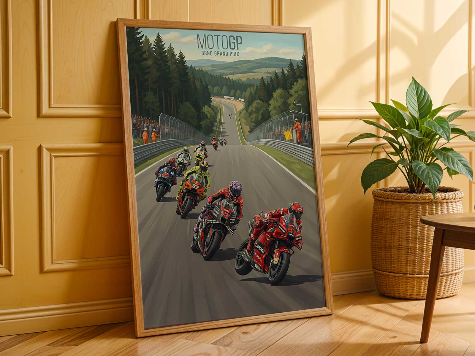
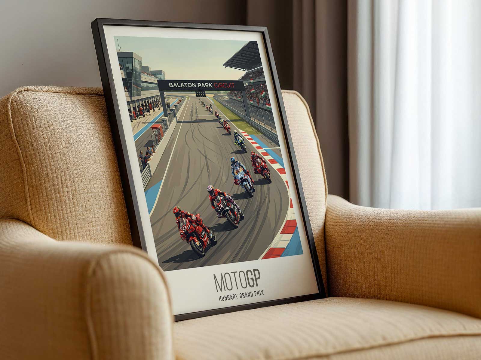
The KTM RC16’s bright, orange-dominant livery reads immediately as a visual anchor in poster form. Against the rolling hills and tree-lined ridges that define Mugello’s Tuscan panorama, that high-contrast colour becomes more than team identity: it becomes the focal point that pulls a composition together, slicing through scenery and light to compress speed into a single still.
Photographic galleries from recent Mugello events show how photographers use the circuit’s landscape and variable light to heighten drama. Open sightlines and the gentle elevation of the Tuscan terrain give images a horizon that feels lived-in; distant ridgelines and fields provide a calm, textured backdrop that offsets the mechanical tension of a race machine. In a poster, this combination of machine and place reads as two layers of memory — the RC16’s livery and silhouette in the foreground, Mugello’s countryside as the emotional stage behind it.
Light at Mugello is a compositional tool. Official galleries and event photography demonstrate how sunny, golden-hour or overcast conditions alter the RC16’s graphic impact: bright light intensifies orange and casts crisp shadows that emphasize lean angles and wheel alignment, while softer light lets the livery sit within atmosphere, where heat haze and muted colour shifts suggest motion even in a static image. Those lighting choices determine whether a poster feels hard-edged and aggressive or spacious and contemplative.
The tension that makes a KTM poster compelling does not come solely from the bike’s posture but from the way that posture relates to place. A braking silhouette or a cornering lean reads against Mugello’s visible run-offs, where the road’s rhythm and the slope of the terrain suggest a narrative beyond the frame: entry, apex, exit. Professional galleries from MotoGP and third-party publishers illustrate how trackside texture — tarmac grain, kerb colour, and the scattering of advertising panels — interacts with livery contrast to create a layered composition that rewards the viewer on repeated looks.
[IMAGE_INSERT_ARTICLE_01]
Crowd energy and grandstand presence at Mugello appear in many event photographs as a peripheral but important element. Spectator terraces and tree-lined spectator areas add scale and human warmth; in poster form these cues anchor the scene in real-world experience, so the image functions as a lieu de mémoire — a place that evokes the race day atmosphere even when shown far from the circuit. That sense of place is what elevates a MotoGP image from mere action shot to collectible wall art.
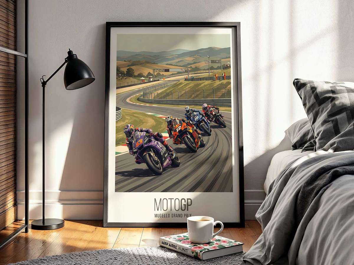
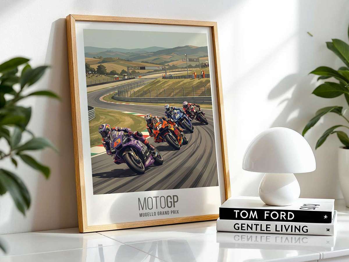
For interiors — offices, studios, garages or game rooms — a Mugello-set KTM poster offers a particular clarity: bold team colour provides a strong focal point for a room, while the Tuscan landscape and photographed light supply depth and mood. The poster’s visual logic helps it sit comfortably beside other decor elements because the landscape brings natural tones and horizon balance, and the machine supplies the necessary edge and narrative tension.
Design commentary on MotoGP liveries and the documented visual identity of KTM’s RC16 support this reading: the orange-dominant scheme is purpose-built to read at speed and at distance, which is exactly the quality that translates well to large-format prints. Likewise, the abundance of high-resolution Mugello galleries and commercially available circuit posters shows there is a clear visual vocabulary to draw from when creating or selecting a KTM-Mugello wall piece.
Seen as a single object on a wall, a KTM at Mugello poster becomes an encounter between machine and place: the livery’s instant graphic signal, Mugello’s Tuscan horizon and the chosen light together create an image that compresses motion, location and mood. That compression is what makes the poster feel immersive — not by shouting, but by aligning colour, landscape and compositional tension so a room can share in a specific moment of MotoGP atmosphere.