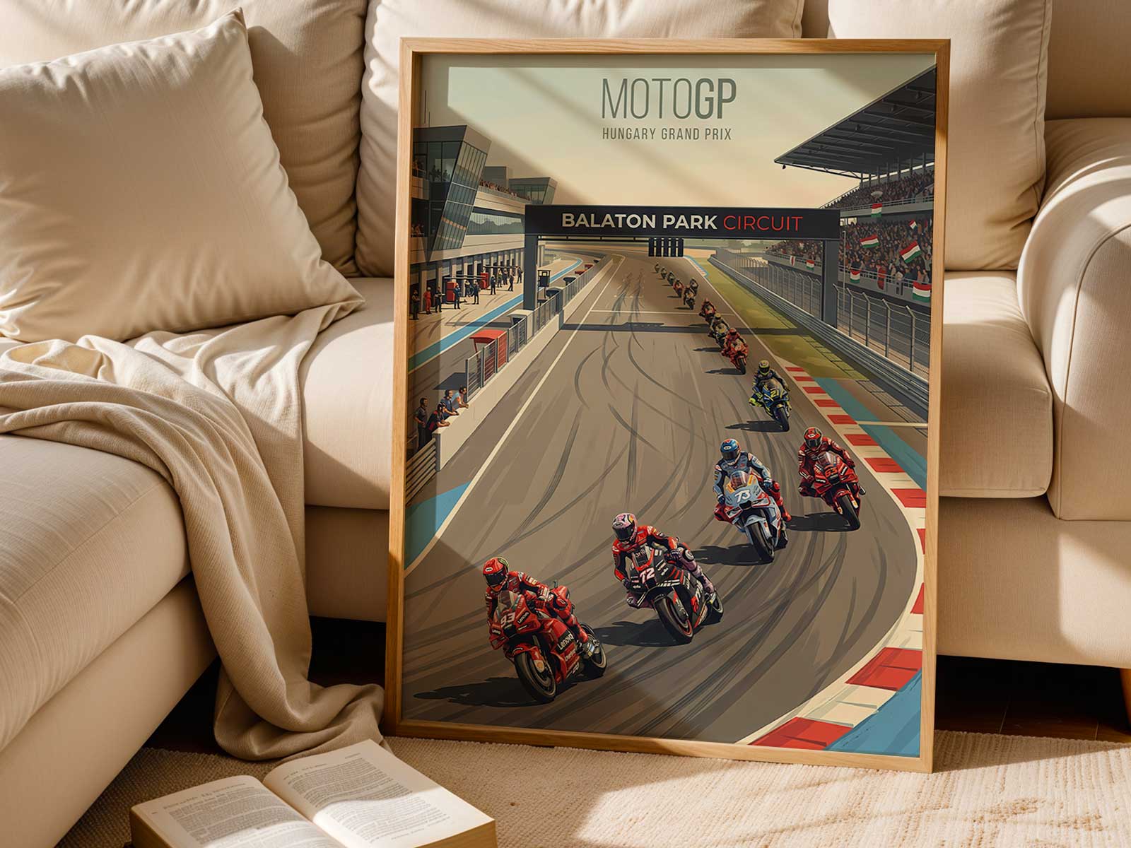
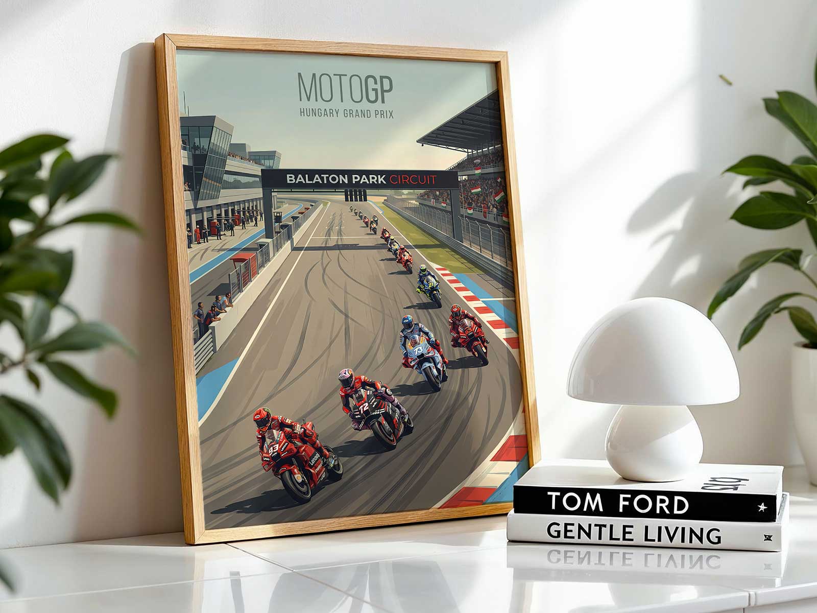
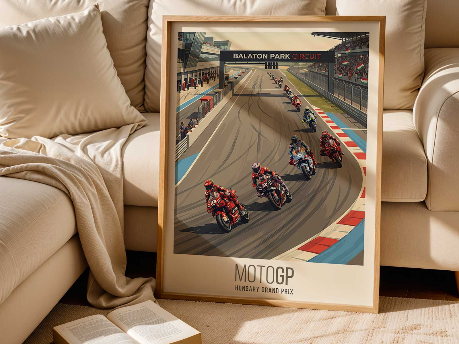
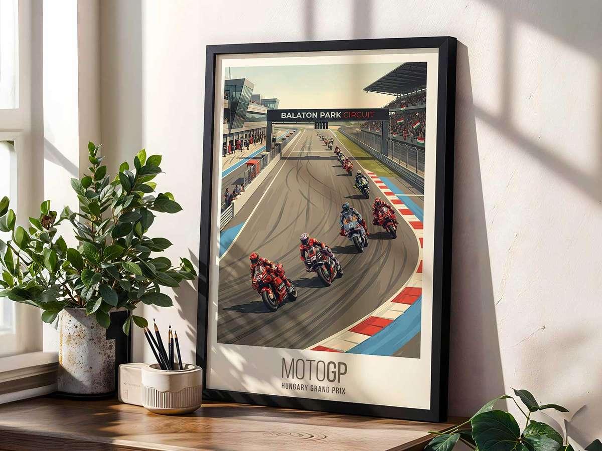
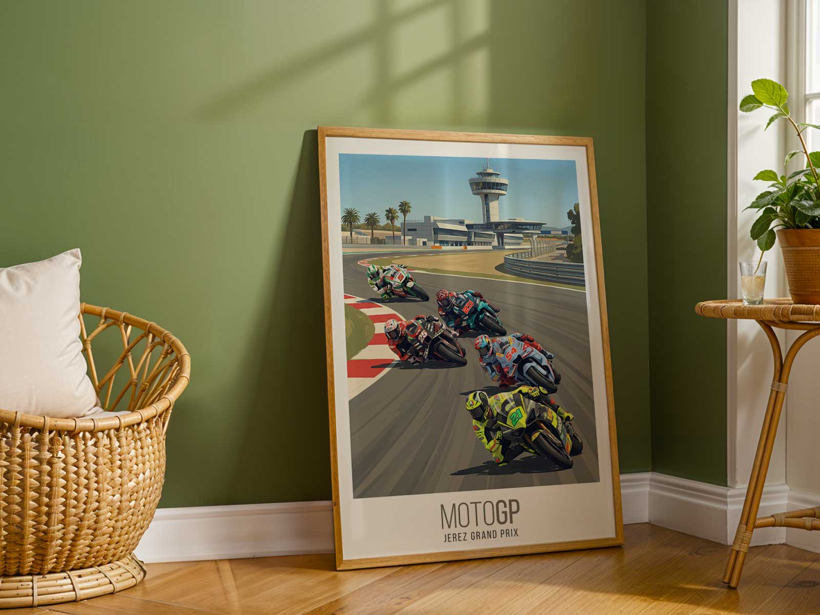
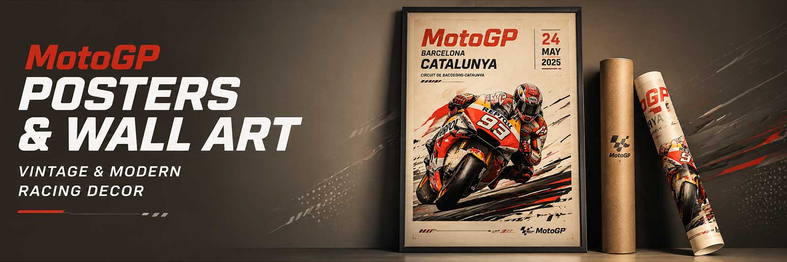
This Morbidelli poster makes the rider’s body the principal language of the image: a study in tension where weight, angle and gaze compress the motion of a race lap into a single, decisive frame. The composition uses the rider as an armature — the shoulder line, elbow tuck and head placement staking claim to the center of the picture while the machine becomes an extension of controlled force. Look closely and you see the art is not merely portraiture but a choreography of technique.
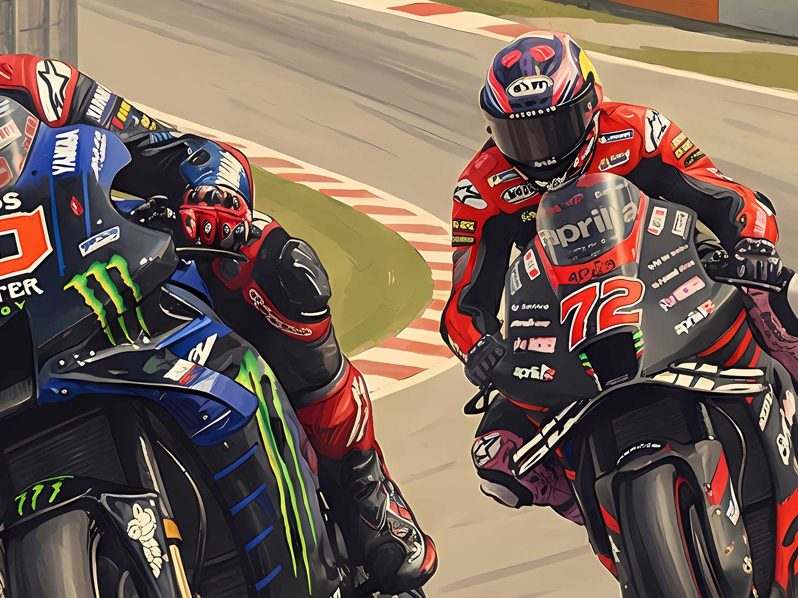
The most immediate signal is the lean and its geometry. The way Morbidelli’s torso drops toward the inside of the corner while the knee reaches for the track creates a diagonal that pulls the eye and implies speed even on a static wall. That diagonal is balanced by the rider’s upper-arm compression and a lowered head — small, compact gestures that read as efficient aggression: braking and weight transfer are implied without motion blur or race context. This is how effort is visualised; the body tells you where the forces live.
There is a quiet technical narrative in the hands and shoulders. A relaxed but firm grip, shoulders squared to support steering inputs, and a subtle counterbalance in the hips suggest a rider negotiating both machine and limit. The image frames those details with clarity, so the viewer understands why this stance works: it’s about measured control rather than chaotic speed. That calm-precision duality—aggression held in check—gives the poster a taut energy that feels purposeful instead of merely frenetic.
[IMAGE_INSERT_ARTICLE_01]
Beyond biomechanical reading, the rider’s head placement and gaze define the poster’s emotional axis. Even when the visor hides the eyes, the tilt of the helmet and the direction of the chin communicate focus: intent aimed at a line not shown. This unseen trajectory is a powerful compositional device. It lets the room inhabit the race, inviting viewers to imagine the apex, the throttle transition, the sensory compression of a lap reduced to silhouette and posture.
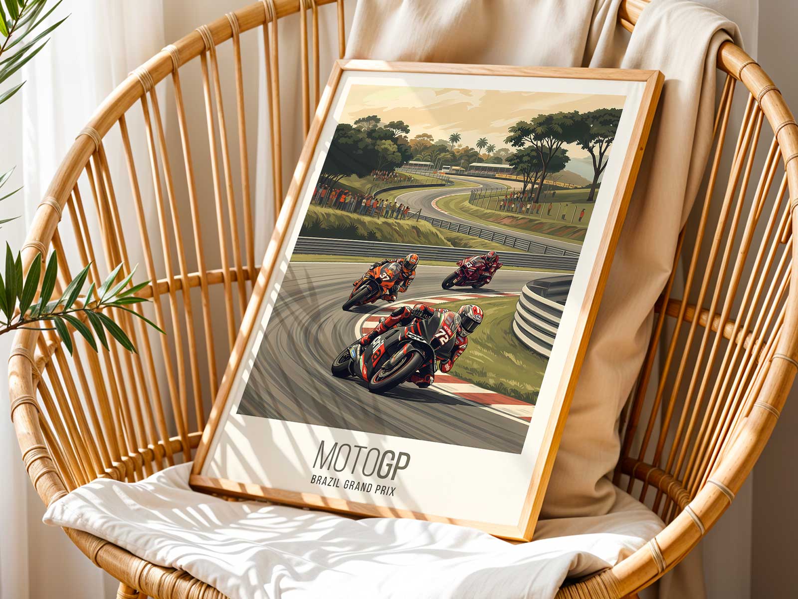
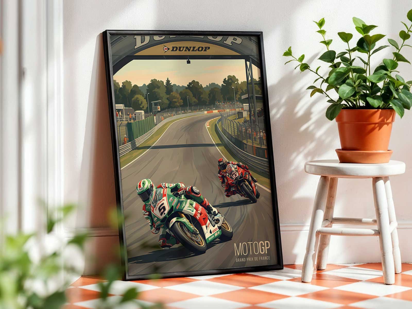
Compositionally the bike’s silhouette and the rider’s form create a visual counterpoint to negative space, giving the print an architectural quality. In interiors—studios, garages, offices—the image reads like a statement piece because it anchors a room with movement that feels directional rather than decorative. The piece works best when placed where its implied motion can interact with furniture or sightlines: over a low shelf so the lean appears to travel across the wall, or above a desk where the forward momentum subtly encourages forward thinking.
This poster’s desirability arises from specificity. It does not rely on logos or team colors alone; it sells a posture: an exact arrangement of limb and machine that speaks of competence under load. That arrangement is what makes a rider-led poster memorable—the viewer can sense the torque in a forearm, the compression in a knee, the discipline in the shoulders. Those are concrete, visual reasons to choose this artwork for a space where clarity of character matters.
Viewed as a wall piece, the image functions like a condensed race memory. It suggests circuit scale and competition without needing a crowd or podium. The human figure is both subject and story: a focal point that defines mood, asserts motion and creates a lasting visual identity for the room. For anyone seeking art that communicates control, tension and the refined violence of speed, this Morbidelli poster translates those qualities into a single, resolute composition.